
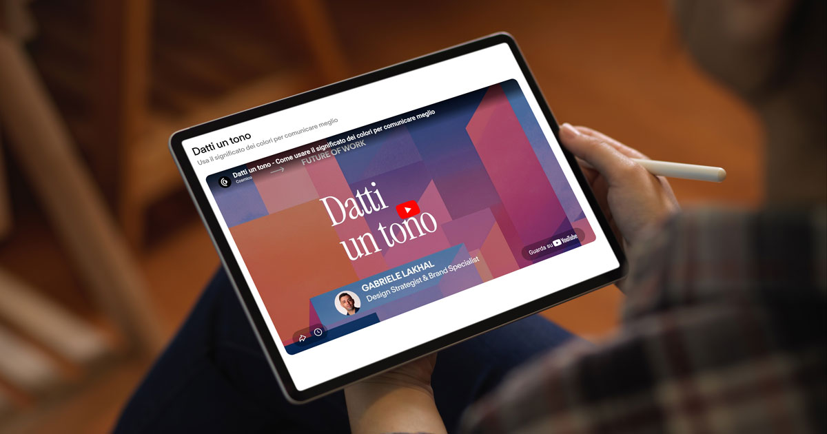
On 30 April I ran a webinar for Cosmico titled “Datti un tono” (luma.com/da3duvcu). Forty-five minutes live to take apart one of the most widespread dogmas in design and visual communication. Colour psychology, the way it gets sold in the manuals, does not hold up.
Cosmico is a community of professionals and companies (wearecosmico.com/it) working in design, strategy and marketing, so the audience showed up with clear ideas already. Red communicates urgency, blue conveys trust, green means sustainability. These are associations you read everywhere, from brand design books to LinkedIn threads. The problem is that neuroscience research tells a different story. Colour perception depends on culture, context and the memory of the person looking, not on objective properties of the colours themselves.
What I covered in the Cosmico webinar
Following the manual or copying a competitor’s palette produces identities that look alike. I see it every week in the projects that land on my desk. Different brands using the same colour codes because they think those codes work on everyone. The result is predictable. Nobody remembers them, and the visual fails to do the job it should do.
During the talk I showed an alternative process, based on the real mechanisms of colour perception. Implicit emotional memory, personal associations, the cultural context of the audience. Three levers that work together to build a palette people recognise and remember, because it speaks their emotional language and not the generic one of the industry.
Everyone connected took away four concrete things. Why colour emotions are not universal. How perception works and why your brain tricks you when you look at a colour. How to build authentic, memorable colour associations. How to define your palette with a process that stands on data, not on the trend of the moment.
Watch the recording of the Cosmico talk
If you missed the live session or want to revisit the key points, you’ll find the full recording below. Forty-five minutes that change the way you choose colours for your brand or your clients’ brands.
If you want a colour analysis done on your brand, with the method I showed in the webinar, write to me. I’ll tell you right away whether it makes sense to work together.

